Anyone who’s spent any time watching CSPAN lately knows that public policy debates in the U.S. often center on dramatic stories. Opposing sides compete to see who can bring the most tearful witnesses to the table, who can show the most heart-wrenching photos, or who can present the most dramatic anger. That’s a natural tactic. Policy discussions, like most debates, are a sales job, and good salesmen are those who are able to make emotional connections. Unfortunately, in both sales and policy discussions, emotional connections do very little to guarantee a good outcome. Emotional reactions to anecdotal stories can often skew the discussion, causing participants to overlook hard data. Again, perfectly natural - most people have difficulty dealing with the piles and piles of numbers that weigh on a policy decision.
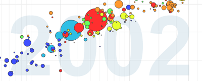
A Swede named Hans Rosling has come up with an excellent solution to this problem. He’s developed some software that can present multiple variables of data in time series through animated charts. He’s got a gift for presenting data using stories that can connect with his audiences, and his presentations are backed up by the unique data displays his software makes possible. I think he presents a great example of how people who understand data can use it to tell stories and actually sway debates of all kinds.
You can see a couple of videos of Hans in action here and here.
Google has recently purchased Hans’ Trendalyzer software, and it’s now available online in beta form here. With Google’s resources, look for some great things to come out of this project.